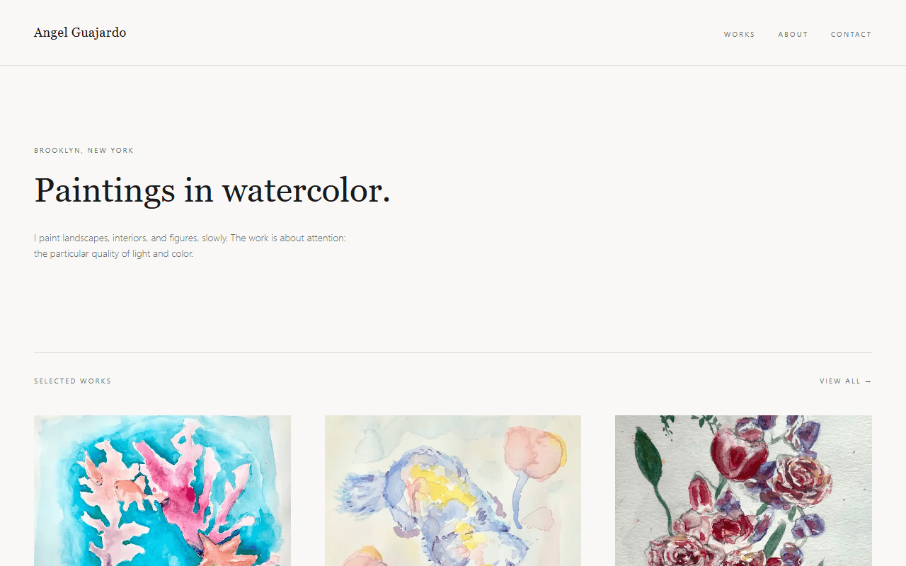
Overview
A personal website built to present my watercolor paintings in a clean gallery. The design deliberately stays out of the way: generous whitespace, restrained serif typography, and large images let the work speak for itself.
The Problem
I wanted a single place to share my art with friends, galleries, and potential buyers, without relying on social media feeds where images get compressed and buried. The site needed to load fast, look great on phones, and be easy for me to update with new pieces.
My Role
Solo designer and developer. I handled everything from the initial wireframes and visual design to the implementation, image optimization, and deployment.
Development Process
I started with sketches of the gallery layout, then prototyped a responsive image grid. Once the grid felt right, I built the site with statically generated pages so every page loads instantly, and set up an image pipeline that serves appropriately sized files for each device.
Key Features
- Gallery of selected works with lazy-loaded, optimized images
- Individual artwork pages with title, medium, and story
- Simple contact path for commission inquiries
- Statically generated pages for fast loads and easy hosting on Vercel
Challenges & Solutions
High-resolution artwork scans were slowing page loads to a crawl on mobile connections.
Introduced automatic image resizing and modern formats (WebP/AVIF) with responsive srcsets, cutting page weight dramatically without visible quality loss.
Paintings come in different aspect ratios, which broke the uniform grid layouts I tried first.
Settled on a consistent crop for the gallery grid with the full, uncropped piece shown on each artwork's own page, keeping the grid tidy without misrepresenting the work.